


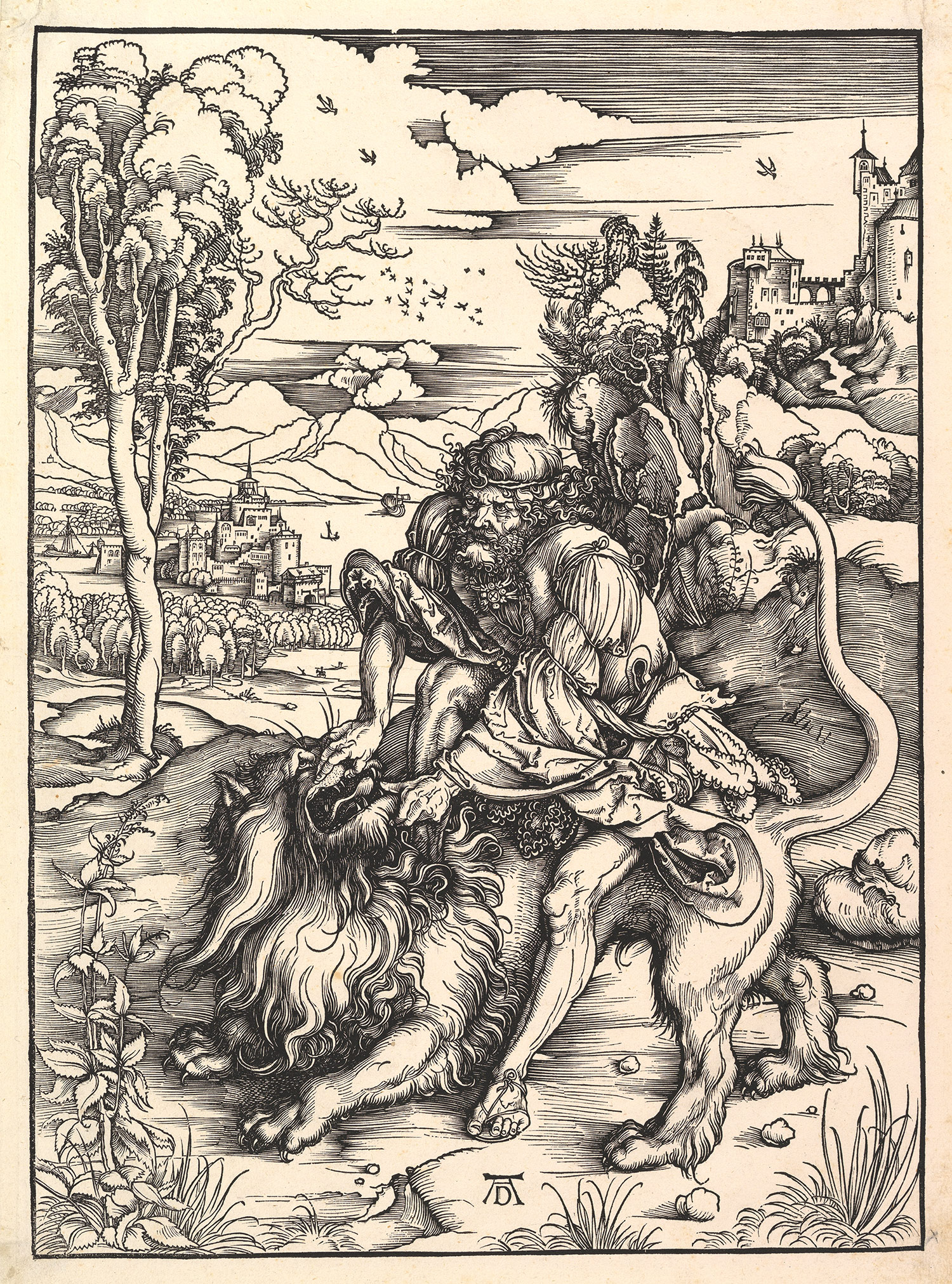
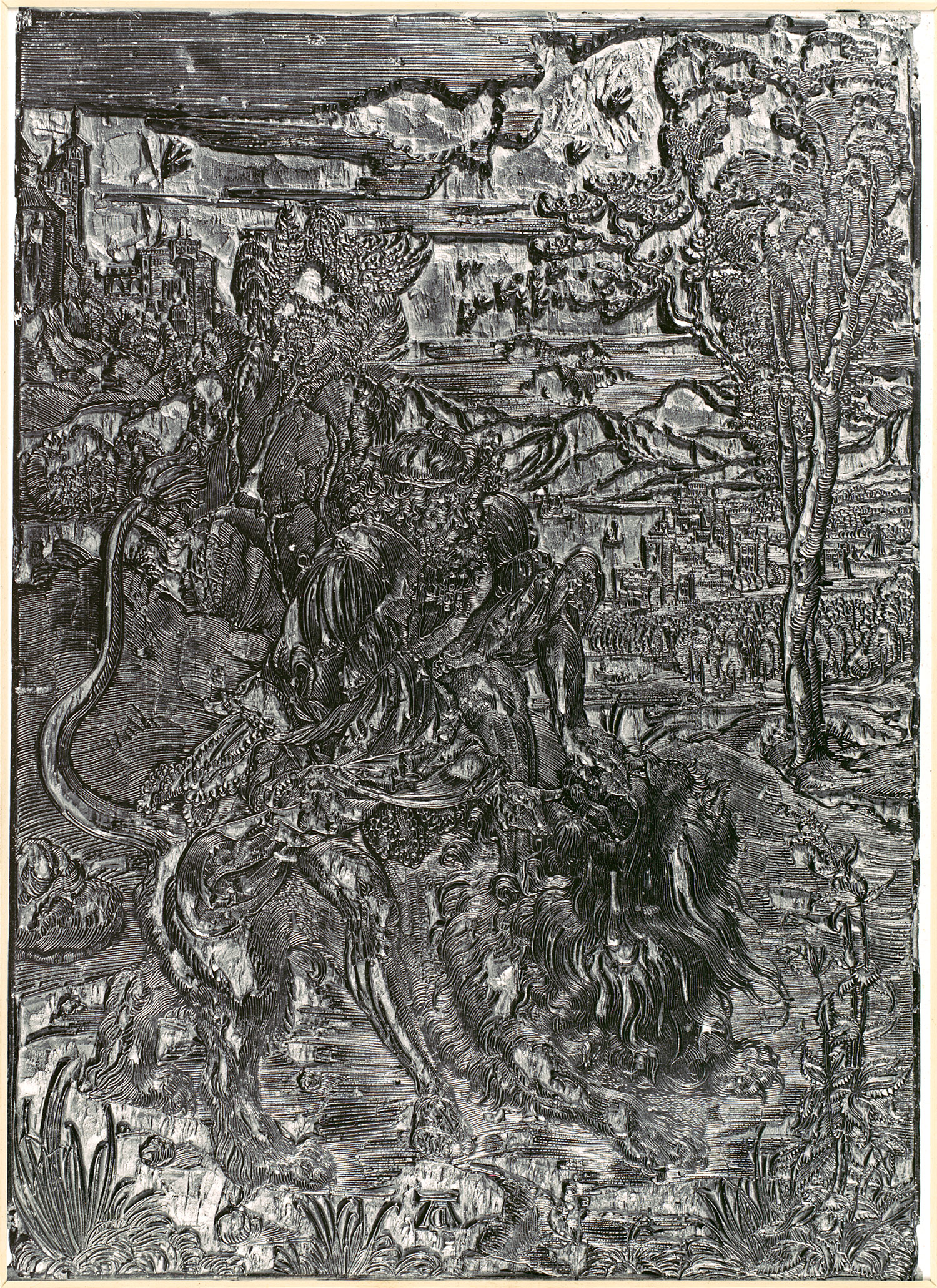
Known in Japan from the eighth century, the technique of stamping from woodblocks was used to print textiles before it was applied to paper. A relief process, woodcuts are produced by inking a raised surface against which a piece of paper is pressed, either manually or by running it through a press, to create an image on the paper. The rubber stamp and potato print are familiar forms of relief printing. The design of a woodcut is produced by elimination, cutting away everything except the lines or shapes to be printed. Some idea of the technique involved can be gained by looking at the woodblock (19.73.255) that was used to print Albrecht Durer's Samson Rending the Lion (24.63.111).
Related
The first crude woodcuts appeared in Europe by 1400. Given the difficulties of scraping out the wood between the lines to be printed, and the danger that lines that were too thin would break under pressure, early woodcuts consisted mainly of thick outlines with minimal shading. Resembling coloring books in their design, they were meant to be colored by hand or with stencils. Many early woodcuts served as illustrations for the new printed books, and the demands of book illustration caused the medium to become more sophisticated and its subject matter more varied. It was the brilliant German artist Albrecht Dürer who transformed the medium with woodcuts like Samson Rending the Lion, such fully realized works in black and white, complete with subtle gradations of tone and suggestions of texture, that Durer's contemporary, Erasmus of Rotterdam, claimed that to add color would be to "injure the work."
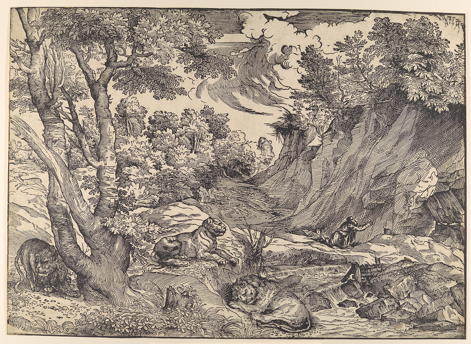
In Italy, the woodcut was taken into new territory by the great Venetian painter Titian, who chose the medium to publicize his drawn inventions. In his beautiful Saint Jerome in the Wilderness (22.73.3-119), the bold and fluent linework, as well as the unity and animation of the entire surface, strongly suggest that Titian drew directly on the block, and the cutter followed his marks as closely as possible. It was in the medium of woodcut that color was first introduced into printmaking, in the prints known as chiaroscuro woodcuts.
Chiaroscuro Woodcuts
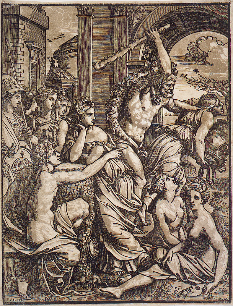
The earliest colored woodcuts were intended to imitate the appearance of a type of drawing on colored paper known as chiaroscuro, much sought after by collectors. In these drawings, the colored paper served as the middle tone, and the artist worked toward the light (chiaro) by adding highlights with white gouache, and toward the dark (scuro) by adding crosshatching in pen or a dark wash with a brush. The chiaroscuro woodcut, invented in Germany by Hans Burgkmair around 1509, was created by printing a line block—which carried the contours and crosshatching, and could sometimes stand alone as a black and white woodcut—together with one or more tone blocks. If there were only one tone block, it would print a mid-tone that would function in the same way as the colored paper did in the drawings. Where more than one tone block was used, it was possible to suggest levels of shading, as in a wash drawing. Where the blocks had been cut away, the paper would remain unprinted, and these white areas would serve as the highlights.
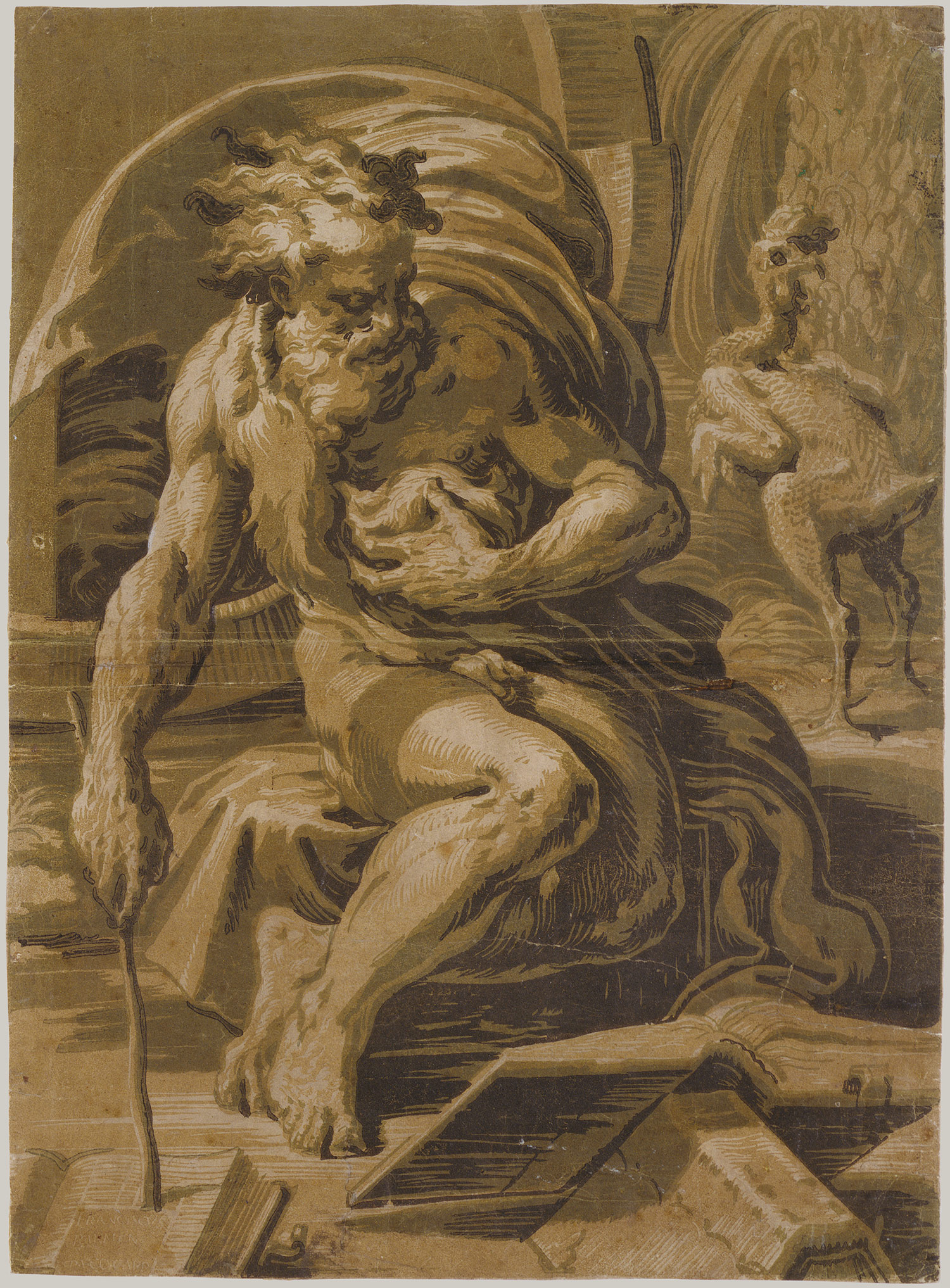
One of the great masterpieces of the chiaroscuro print in the North is Hans Baldung Grien's eerie Scene of Witchcraft (41.1.201), in which the gray tone block and flickering highlights contribute to the oppressiveness of the scene. The first Italian to create chiaroscuro prints, Ugo da Carpi, is best known for his Diogenes (17.50.1), in which he does away with the line block and creates the image entirely through areas of tones. While the Diogenes is based on a wash drawing by Parmigianino, Ugo da Carpi's earliest documented chiaroscuro woodcut was produced in collaboration with Titian. However, by the end of the sixteenth century, Titian had lost interest in having the lines of his drawings duplicated through woodcut; he sought instead to have the color and effects of light of his paintings translated into the intaglio technique of engraving.
Book Illustration
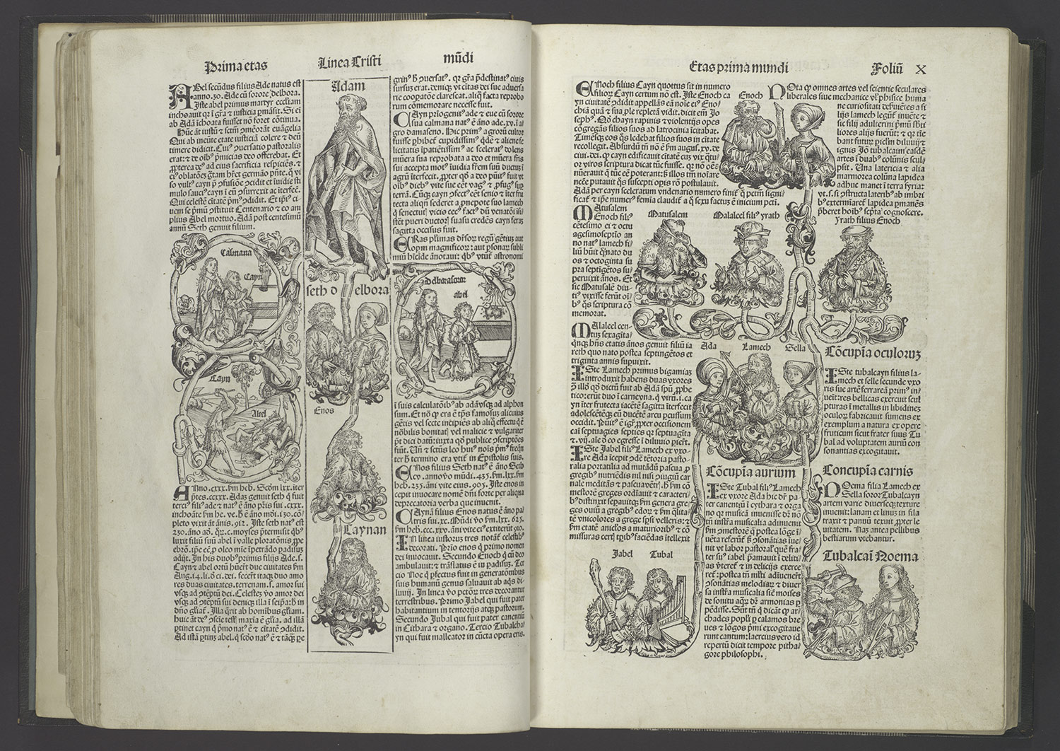
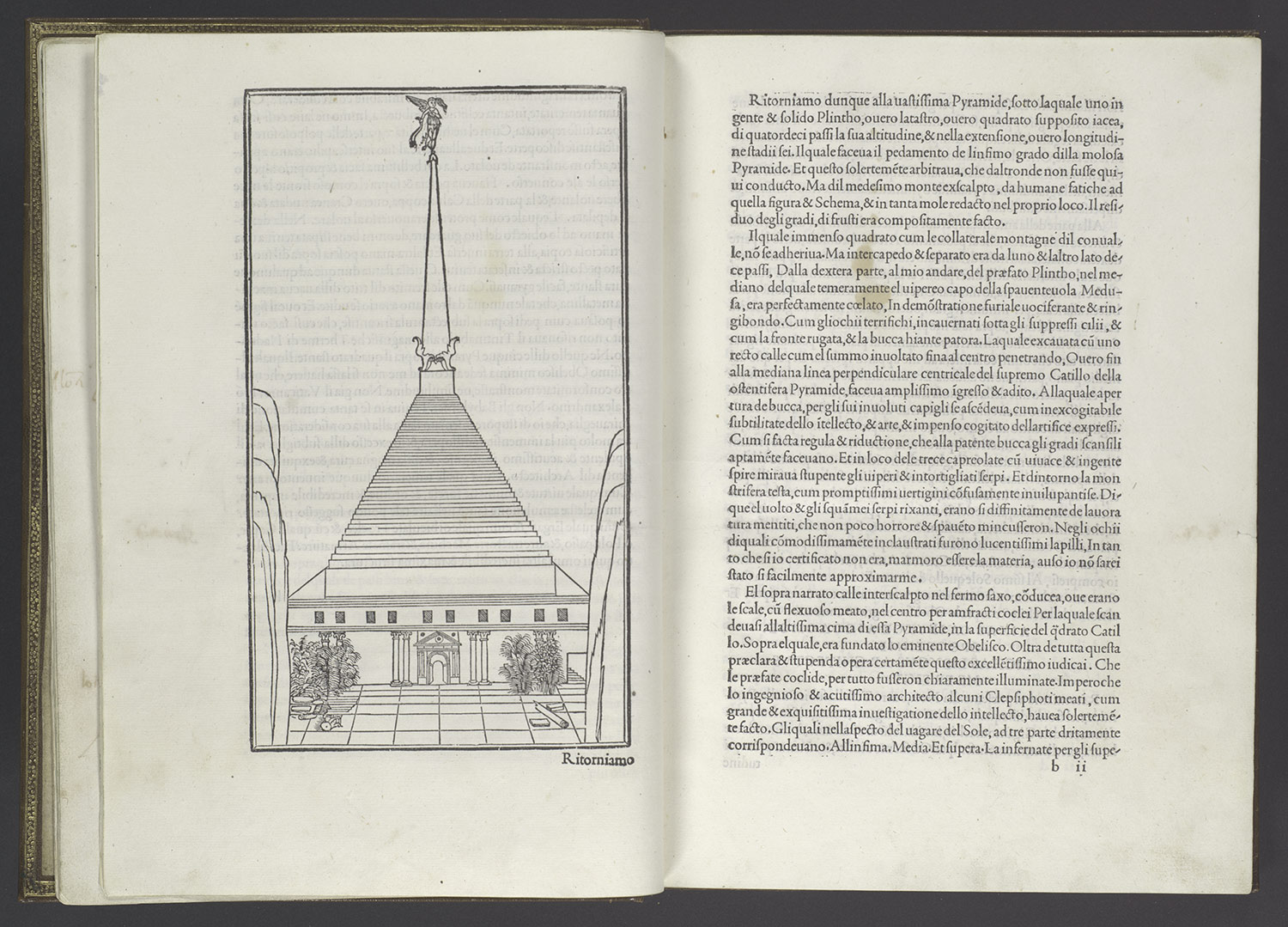
Because the printing of movable type, like the woodcut, is a relief process, once the printing press and movable type were invented in the mid-fifteenth century, woodcuts provided the ideal means for illustrating early printed books. The woodblocks could be placed alongside the type in the flatbed press and printed at the same time. The same image could be used to illustrate more than one text or could even be used more than once in the same text, as in the lavishly illustrated Liber Chronicarum (Nuremberg Chronicle) (1981.1178.29) where the same generic view of a city is repeatedly used to signify cities whose topography was unknown. Six years later, in Venice, another landmark in the history of the illustrated book was published, the lovely Hypnerotomachia Poliphili (Poliphilo's Dream about the Strife of Love) (23.73.1). Both books are models of the successful integration of text and image into the overall layout of the page, yet they evidence very different aesthetic sensibilities. The pages of the German book are densely filled with the texture of short, angular lines that compose both the Gothic script and the lively illustrations—many pages are enlivened by genealogical trees in the form of curling vines peopled by half-length figures—to create an impression of great animation. In the Italian book, by contrast, the relationship between the rectilinear typeface, based on ancient Roman inscriptions, and the spare and elegant woodcut illustrations creates a sense of classical calm and balance.
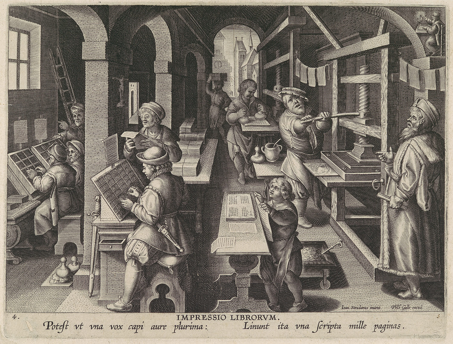
By the mid-sixteenth century, engraving had come to be the preferred medium for book illustration. Since engravings and type require different kinds of presses, the illustrations had to be printed independently, usually on separate sheets, and could no longer be visually integrated with the text.





 Timelines (8)
No comments:
Post a Comment